
Game Dev Mistakes That You Should Avoid At All Costs

Game Dev Mistakes That You Should Avoid At All Costs
There’s nothing more exciting than seeing your ideas come to life. Colors, fonts, design, flow–all of it as you had planned. This is precisely what’s offered by the hybrid field of game development.
Developing a game means working on many different creative dimensions, including storytelling, designing, programming, and more. And if you’re an indie developer, chances are you’ll be managing all of those outlets yourself (or with a selected few). As a result, there are a lot of opportunities for error (and therefore, improvement) during the entire game dev journey.
Through this article, let’s look at some common mistakes of indie game developers, and what you can do to avoid these mistakes. We’ve broadly categorized these mistakes of indie game developers to cover pretty much the entire game dev lifecycle (except marketing… that’s for another day!).
UI — Visuals and Audio

One of the key challenges of indie game developers is that you’ll often be working with your own or a friend’s art for the game (unless you’re a solo developer). Very few new developers have the resources to work with professional artists. Here are some things to avoid:
- Using multiple fonts: Set a hard limit for two or three fonts for the entire game. One heavier font for titles, slightly lighter font for subheadings, and one easily digestible font for slightly longer texts. Anything more will become a distraction.
- Having too much text: Too much text can often be overwhelming. Avoid having too much text on one screen. Keep all instructions, explanations, and set-ups only as long as they need to be.
- SHOUTING AT THE READERS: Refrain from using all-caps casually. Use it very sparingly, and only for titles, emphasis or single line instructions, never for longer text.
- Not being consistent: Regardless of whether you’re a visual artist or not, you should strive for consistency in the UI and art style. To put it simply, consistency can provide a professional look. Even a lo-fi art style that imitates scribbling can look intentional and amazing if you keep it consistent in terms of colors, line thickness, fonts, and style.
- Using too many colors: Minimalism in colors is always a conservative choice when rolling your own visuals. Make your colors matter, consider if an element really needs to be a different color or if it might look better with other elements. If you’re not too much into color theory, use a color schemer tool. Color palette generators are your friends. Use them and stick to them.
- Not taking care of the music: Music is extremely important in setting up the context and mood for your game. Prepare a soundtrack that evokes the exact mood you want players to feel when they first start your game. Consider your game’s setting in your selection. For instance, don’t use an epic orchestra theme for something mundane, or refrain from crossing genres by using electronic music for a fantasy game.
UX — Design and Usability
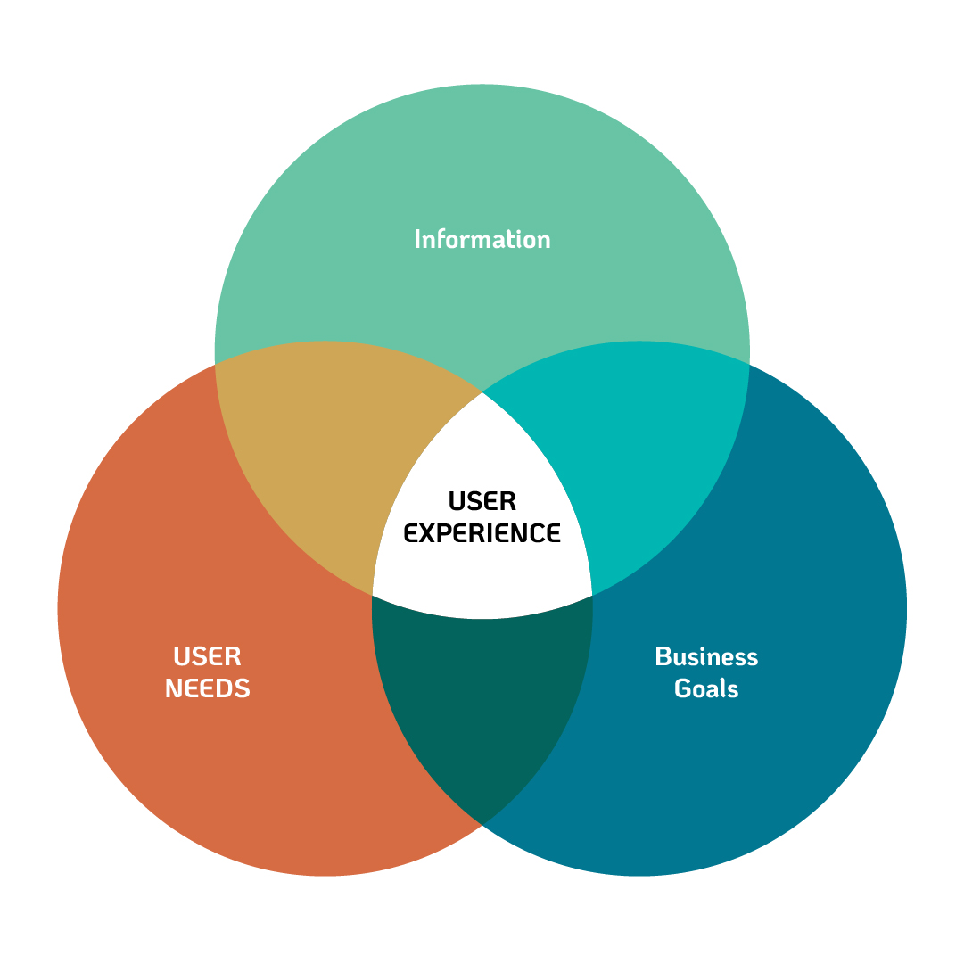
Often, mistakes are made around how a game feels. Many of these will just boil down to “keep your game understandable”, but all of them require reiteration because it is easy to get this wrong.
- Not providing a manual: Regardless of whether you send an unfinished prototype or submission for release, ALWAYS include instructions on how to play the game. Users won’t prefer your game if they don’t know how to play it. If a proper tutorial is out of scope, include a single screen of simple directions/instructions.
- Providing incomplete instructions: This is one of the classic game design mistakes! While creating instructions, make sure you’re not combining questions. “How to play?” and “What to do?” are two different questions that you should separately answer. For instance, in a platformer you would have to tell the player both “use the arrow keys to move and use space to evade enemies” and “reach the right end of the level before the time runs out.” Your instruction screen has to cover both aspects, separately. Give the player a goal and tell them how to reach it.
- Having long setup menus: Ideally you want your user to have as little interaction with the screen (in the form of checking boxes, clicking on “next”), as possible. So, avoid having long setup menus and asking the player to make a ton of decisions before they know what those mean. Customization is fine, but the player should first be given the time to see what it’s even for. A character selection screen is neat, but six separate screens for selecting game mode, control scheme, score system, character class, game length, etc. is too much.
- Not playtesting the game: Organizing playtesting sessions will save you a lot of eventual headache. But the important thing here is that you shouldn’t tell your testers what to do. Let your game speak for itself. Have testers think out loud and make notes where they struggle.
- Confusing understandability and accessibility with a low difficulty: Even the most complex games, if well explained, will be playable by even the casual user. Games can be incredibly difficult but super simple to understand. The point being — you don’t need to simplify the concept of your game for people to participate in it. Instead, you need to explain your games properly, and people will start participating. Accessible games don’t necessarily have to be low difficulty games.
Technical
- Waiting to test the game: Don’t wait too long to test your game; especially if you’re working with new tech. Test the export as soon as you have something playable, and then test it again several days before the deadline.
- Not testing the final build: This shouldn’t have to be said, but when you upload your game somewhere and you have to submit a link to the build, test that build. Test if it downloads, opens and plays properly. Submitting a non-functional game (to any sort of review or pitch, but especially to a contest) can get you disqualified instantly.
Conclusion
Building a game is hard! It is easy to make critical mistakes that can derail all your hard work. We hope that, by sharing some of the common game dev mistakes, you won’t have to learn some of these lessons the hard way!
At Beamable, we’ve lived the world of game development. We’ve created a whole set of tools to make building, testing, and scaling your game UI/UX, content, and social features much easier. If you want to avoid mistakes, contact us for help at https://beamable.com/contact-us!